Homework 2: Example Analysis
[For your analysis, please also include citations of other papers that have analyzed these data]
[Data download URL]
Suppose here we set out to analyze the predicability (forecast) of stock prices based on the company's industry, (e.g. technology, science, automotive, industrial, utilities). Then, once we've created a forecasting model that performs reasonable well, we would like to create a theoretical portfolio with minimal variance. That is, by creating a portfolio of stocks that minimizes the overall variance based on the weighted average of each individual asset's variance.
First, we explore the basic properties of the entries in the dataset in order to begin to refine our analysis. Once we understand how our data is formatted and what the data range is for each variable, we investigate the relationship between 10 stocks at a deeper level.
Project goals:
(1) Forecast prices based on similarly behaving stocks (cluster analysis)
(2) Create minimum variance portfolio (optimization)
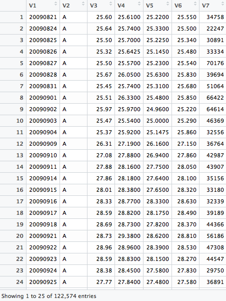
Data description: There are 524 unique ticker names (stocks) represented in this dataset. The dataset contains historical prices from the start of 2009 to the end of 2010, but only a sparse set of 245 days in that range. There are 252 trading days in a year, meaning our dataset contains about 1-year of trading spread across 2 years. For each ticker and each date, the dataset has information on the opening price and closing price, as well as the high and low for that day. In addition, we have the trading volume for each stock each day (the total number of shares involved in transactions). There is no missing data in this dataset.
library(ggplot2)
library(dplyr)
library(tidyr)
library(lattice)
sp500hst <- read.csv("~/Downloads/sp500hst.txt", header=FALSE) # read data
sp500hst <- as.data.frame(sp500hst) # convert to dataframe
colnames(sp500hst) <- c("Date", "Ticker", "Open", "High", "Low", "Close", "Volume") # name columns
sp500hst$Date <- as.numeric(sp500hst$Date) # convert date to number
What does the raw data look like right after reading it into R?
First analysis: a summary of the data
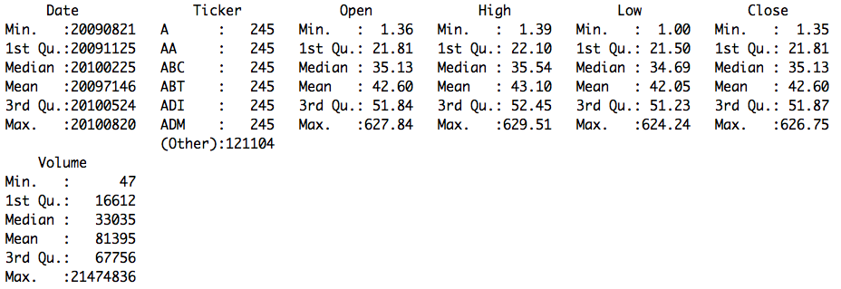
ggplot(sp500hst,aes(x=Date)) + geom_histogram() # plot histogram of dates
Histogram of dates in the dataset
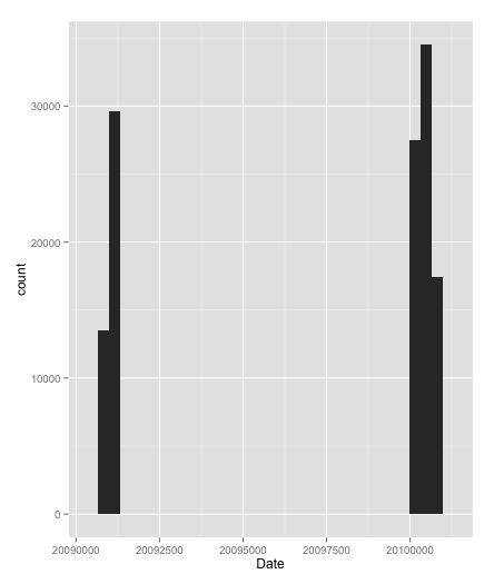
sp500hst_filtered <- sp500hst %>% filter(Date > 20091231) # take only dates in 2010
ggplot(sp500hst_filtered,aes(x=Date)) + geom_histogram() # check that the filter worked
Histogram of dates after filtering for 2010
sp500hst_filtered <- sp500hst_filtered %>% gather(Type,Price,-Date,-Ticker,-Volume) # gather all prices in one column
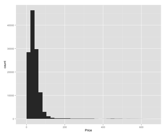
ggplot(sp500hst_filtered[sp500hst_filtered$Type=="Open",],aes(x=Price)) + geom_histogram()
Histogram of opening prices
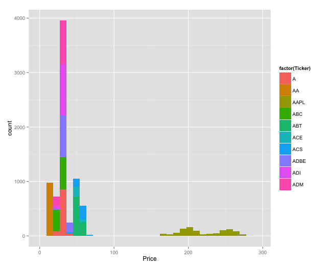
top10 <- head(unique(sp500hst_filtered$Ticker),10)
sptop10 <- sp500hst_filtered %>% filter(Ticker %in% top10) # get top 10 tickers (alphabetically)
ggplot(sptop10[sp500hst_filtered$Type=="Open",],aes(x=Price,fill=factor(Ticker))) + geom_bar()
Histogram of opening prices colored by ticker
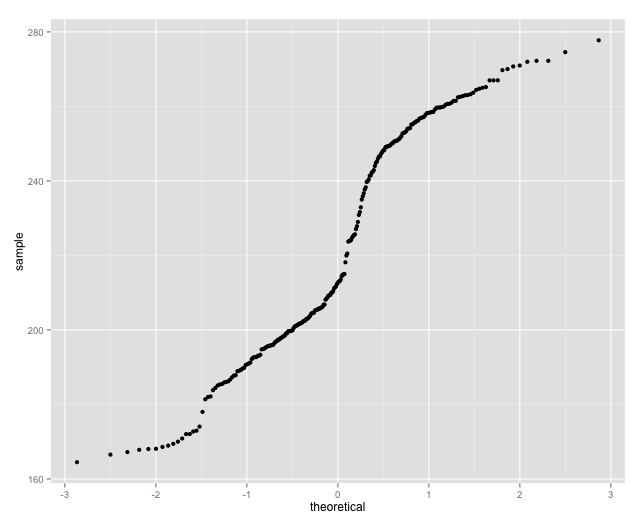
The Apple prices don't look normally distributed, let's check the Q-Q plot.
qplot(sample = sptop10[sptop10$Ticker == "AAPL" & sptop10$Type == "Open",]$Price,stat="qq")
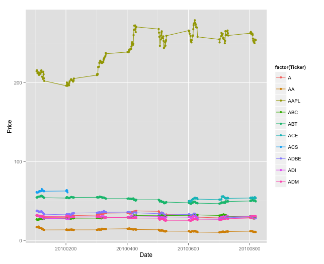
Daily high for each stock
ggplot(sptop10[sptop10$Type == "High",],aes(x=Date,y=Price,color=factor(Ticker))) + geom_point() + geom_line()
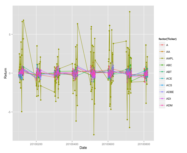
Daily return Z-scores
sptop10$Return <- sptop10[sptop10$Type=="Open",]$Price-sptop10[sptop10$Type=="Close",]$Price
sptop10$Return <- (sptop10$Return-mean(sptop10$Return))/sd(sptop10$Return)
ggplot(sptop10,aes(x=Date,y=Return,color=factor(Ticker))) + geom_point() + geom_line()
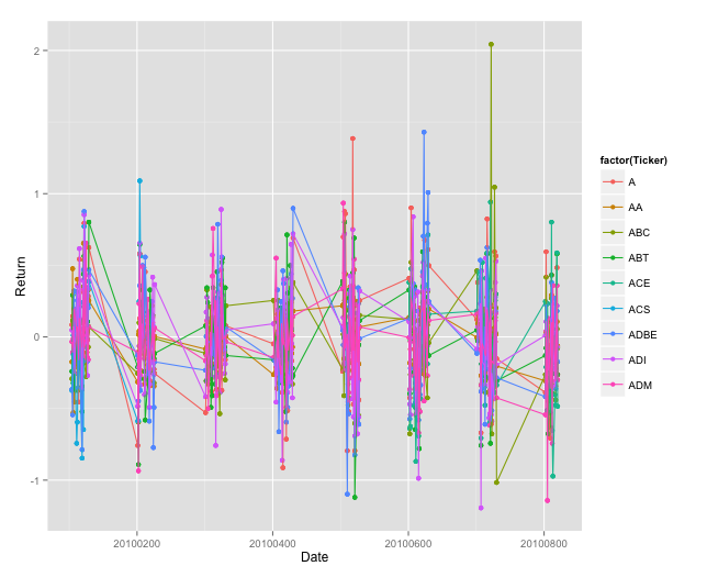
Daily returns without Apple included
ggplot(sptop10[sptop10$Ticker != "AAPL",],aes(x=Date,y=Return,color=factor(Ticker))) + geom_point() + geom_line()
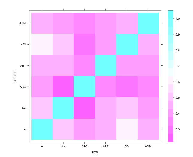
Correlations of daily returns of 6 stocks with full data
max_entries = max(sapply(unique(sptop10$Ticker),function (x) length(sptop10[sptop10$Ticker==x,]$Return)))
stocks <- c()
ret_matrix <- c()
for(stock in unique(sptop10$Ticker)){
if(length(sptop10[sptop10$Ticker==stock,]$Return) == max_entries){
ret_matrix <- cbind(ret_matrix,sptop10[sptop10$Ticker==stock,]$Return)
stocks <- c(stocks,stock)
}}
return_correlations <- cor(ret_matrix)
colnames(return_correlations) <- stocks
rownames(return_correlations) <- stocks
levelplot(return_correlations)
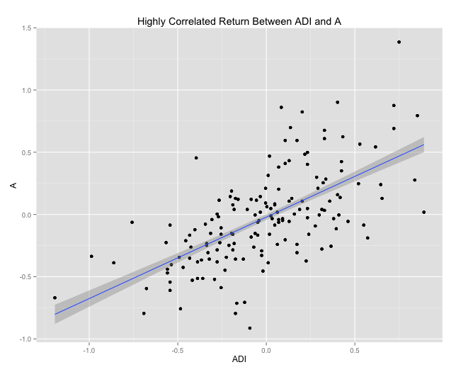
Highest correlated return of two stocks
high_corr <- as.data.frame(list(x=sptop10[sptop10$Ticker == "ADI",]$Return,y=sptop10[sptop10$Ticker == "A",]$Return))
ggplot(high_corr,aes(x=x,y=y)) + geom_point() + geom_smooth(method="lm",se=TRUE) + xlab("ADI") + ylab("A") + ggtitle("Highly Correlated Return Between ADI and A")
Correlations of daily returns of all stocks with full data
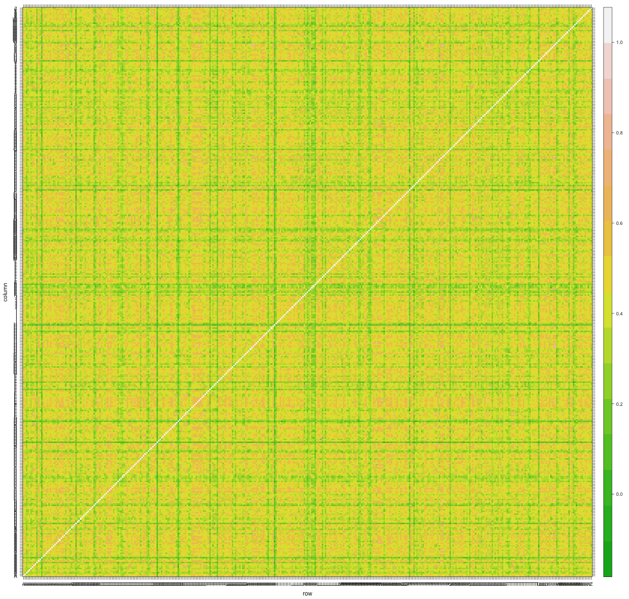
There are some interesting trends to explore deeper here. First, there appears to be some stocks that are not correlated at all with any others. Other stocks that are correlated appear to be clustered in blocks. After clustering the stocks in order to enforce some ordering, we might see more interesting block structure.
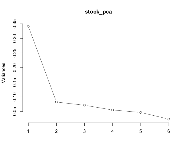
PCA and variance explained by PCs
stock_pca <- prcomp(ret_matrix)
plot(stock_pca, type = "l")
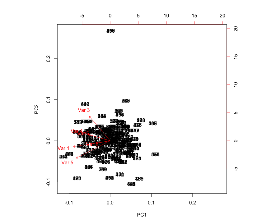
Variables (stocks) on PC loadings
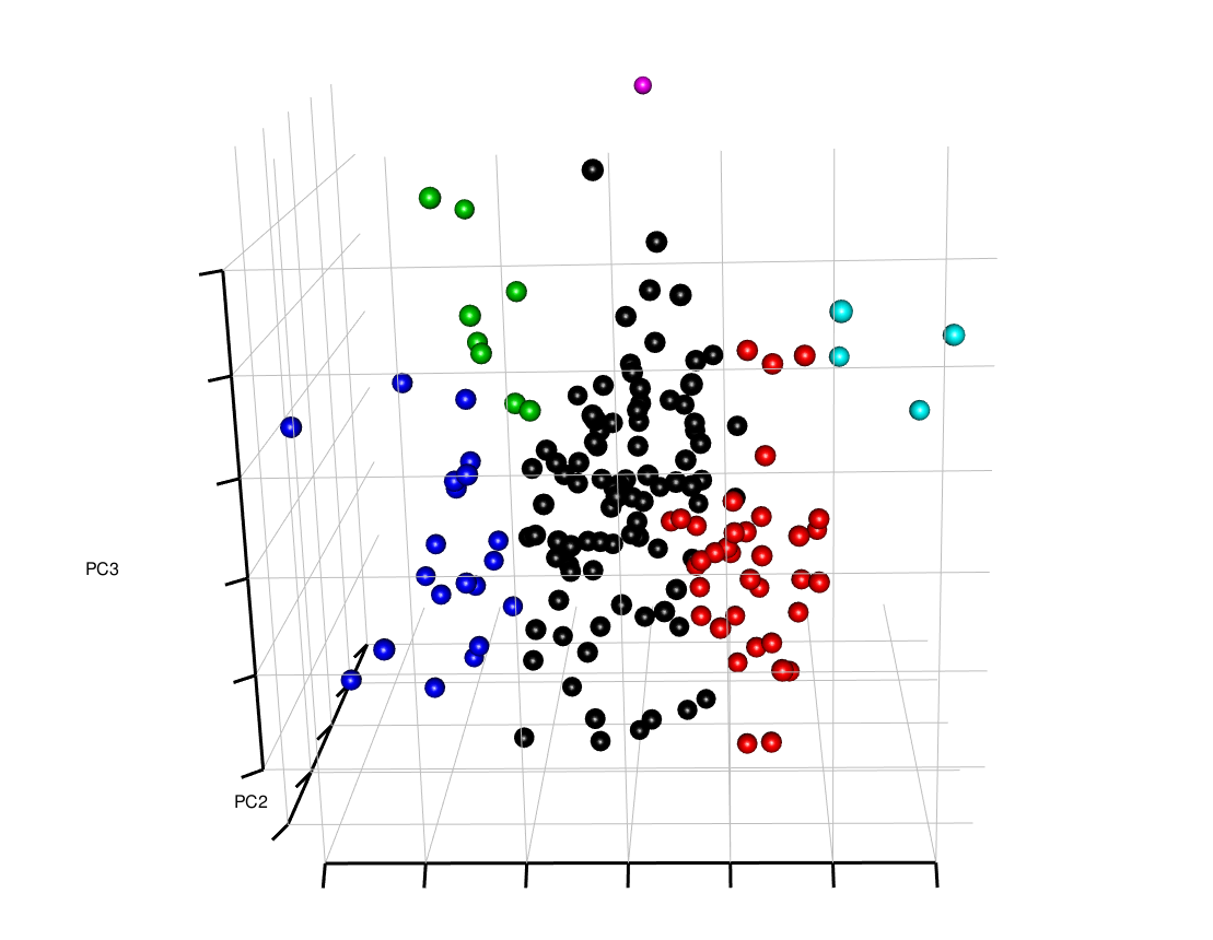
3D PCA Plot of variables
stock_pca <- prcomp(t(ret_matrix))
plotPCA(stock_pca$x[,1:3],6)
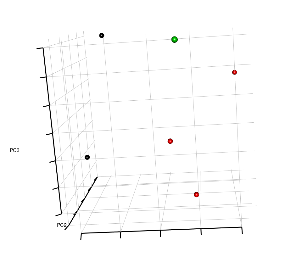
3D PCA Plot of samples
plotPCA(stock_pca$x[,1:3],6)
(credit: http://stackoverflow.com/questions/24282143/pca-multiplot-in-r)
3D PCA Plot of all variables (stocks)
stock_pca <- prcomp(t(ret_matrix))
plotPCA(stock_pca$x[,1:3],6)
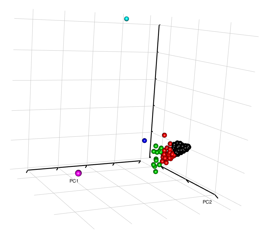
Interestingly, here, the all the stocks seem to cluster together, except for a few outliers. It would be good to identify these to understand whether these outliers are a result of data input error, or whether these stocks do display highly different behavior than the rest.